class: center, top, title-slide .title[ # Linear Models III ] .subtitle[ ## IQA Lecture 6 ] .author[ ### Charles Lanfear ] .date[ ### 19 Nov 2025<br>Updated: 18 Nov 2025 ] --- # Today ### Pivoting Data ### Polynomials ### Residual Plots -- .text-center[ ### *But first...* ] --- class: inverse # Review? --- class: inverse # Pivoting Data  .footnote[Source: [Garrick Aden-Buie](https://github.com/gadenbuie/tidyexplain#pivot-wider-and-longer)] --- # London Boroughs Let's return to the (real!) 2021 crime data from London boroughs... ``` r library(tidyverse) library(broom) metro_wide <- read_csv("https://clanfear.github.io/ioc_iqa/_data/metro_2021_violence_wide.csv") head(metro_wide, 4) ``` ``` ## # A tibble: 4 × 17 ## borough deprivation subregion pop area month_1 month_2 month_3 ## <chr> <chr> <chr> <dbl> <dbl> <dbl> <dbl> <dbl> ## 1 Barkin… High East 221495 36.1 469 449 561 ## 2 Barnet Medium North 411275 86.7 530 580 772 ## 3 Bexley Low East 256845 60.6 370 343 507 ## 4 Brent Medium West 346437 43.2 643 669 792 ## # ℹ 9 more variables: month_4 <dbl>, month_5 <dbl>, month_6 <dbl>, ## # month_7 <dbl>, month_8 <dbl>, month_9 <dbl>, month_10 <dbl>, ## # month_11 <dbl>, month_12 <dbl> ``` But in **wide** format this time --- # Wide Data **Wide data** are data where at least one variable occupies *multiple columns* ``` r dim(metro_wide) # Few rows, more columns ``` ``` ## [1] 32 17 ``` ``` r names(metro_wide) # A column for each month! ``` ``` ## [1] "borough" "deprivation" "subregion" "pop" ## [5] "area" "month_1" "month_2" "month_3" ## [9] "month_4" "month_5" "month_6" "month_7" ## [13] "month_8" "month_9" "month_10" "month_11" ## [17] "month_12" ``` Here the **month** variable is in the *column names* and counts of **violent** crime are under each month -- How could we plot crime by month with these data? -- .text-center[ *It'd be pretty hard with `ggplot2`!* ] --- # Tidy Data What we want is data in **tidy** format -- Tidy data (aka "long data") are such that: 1. The values for a single observation are in their own row 2. The values for a single variable are in their own column 3. There is only one value per cell<sup>1</sup> .footnote[[1] What one value means is subjective—it could be an entire dataset] -- Why do we want tidy data? * Easier to understand many rows than many columns * Required for plotting in ggplot2 * Required for most statistical procedures * Fewer issues with missing values -- *So how do we **tidy** things up?* --- # Pivoting The `{tidyr}` package in `{tidyverse}` was built to get data into tidy format ``` r metro_long <- metro_wide |> * pivot_longer(starts_with("month"), # Take each month column * names_to = "month", # Put col names in month column * values_to = "violence") # Put values in violence column metro_long |> select(borough, month, violence) |> head(3) ``` ``` ## # A tibble: 3 × 3 ## borough month violence ## <chr> <chr> <dbl> ## 1 Barking and Dagenham month_1 469 ## 2 Barking and Dagenham month_2 449 ## 3 Barking and Dagenham month_3 561 ``` -- ``` r dim(metro_long) ``` ``` ## [1] 384 7 ``` .pull-right-60[ .footnote[Way fewer columns and way more rows!] ] --- # How it works  .footnote[Source: [Garrick Aden-Buie](https://github.com/gadenbuie/tidyexplain#pivot-wider-and-longer)] --- # `parse_number()` To make `month` analytically friendly, we can convert it from strings like `"month_1"` to numbers using `parse_number()` ``` r metro_long <- metro_long |> mutate(month = parse_number(month)) head(metro_long) ``` ``` ## # A tibble: 6 × 7 ## borough deprivation subregion pop area month violence ## <chr> <chr> <chr> <dbl> <dbl> <dbl> <dbl> ## 1 Barking and Dag… High East 221495 36.1 1 469 ## 2 Barking and Dag… High East 221495 36.1 2 449 ## 3 Barking and Dag… High East 221495 36.1 3 561 ## 4 Barking and Dag… High East 221495 36.1 4 564 ## 5 Barking and Dag… High East 221495 36.1 5 589 ## 6 Barking and Dag… High East 221495 36.1 6 617 ``` -- Now we can run some models again—but first, let's see *pivoting back* --- # `pivot_longer()` Maybe you *want* the wider data, because your model needs it (e.g., SEM) or to make a data table ``` r metro_wide_again <- metro_long |> * pivot_wider(names_from = month, # Turn months into col names * values_from = violence, # Turn violence in col values * names_prefix = "month_") # Start col names with month_ metro_wide_again |> head(3) ``` ``` ## # A tibble: 3 × 17 ## borough deprivation subregion pop area month_1 month_2 month_3 ## <chr> <chr> <chr> <dbl> <dbl> <dbl> <dbl> <dbl> ## 1 Barkin… High East 221495 36.1 469 449 561 ## 2 Barnet Medium North 411275 86.7 530 580 772 ## 3 Bexley Low East 256845 60.6 370 343 507 ## # ℹ 9 more variables: month_4 <dbl>, month_5 <dbl>, month_6 <dbl>, ## # month_7 <dbl>, month_8 <dbl>, month_9 <dbl>, month_10 <dbl>, ## # month_11 <dbl>, month_12 <dbl> ``` --- class: inverse # Polynomials 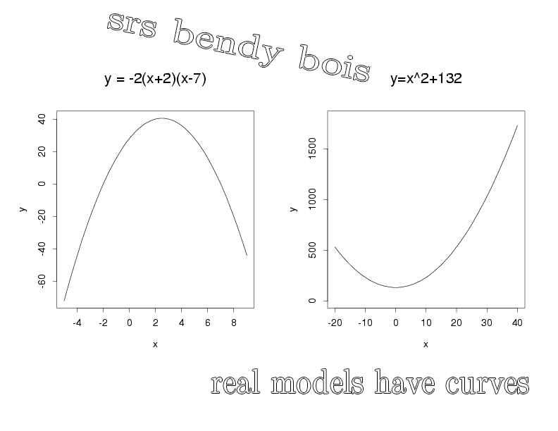 --- # Usual `lm()` Let's fit a simple model predicting crime by month ``` r lm_viol <- lm(violence ~ month, data = metro_long) lm_viol |> tidy() |> select(term, estimate, std.error) ``` ``` ## # A tibble: 2 × 3 ## term estimate std.error ## <chr> <dbl> <dbl> ## 1 (Intercept) 553. 20.5 ## 2 month 10.4 2.78 ``` -- But would we expect crime to increase (or decrease) from January to December? -- Or is it more likely to range *up and down* through the year? --- # Looking at Residuals Looking at residuals can help us figure this out * Recall that residuals are *what our model isn't predicting* .pull-left[ ``` r lm_viol |> augment() |> ggplot(aes(x = month, y = .resid)) + geom_point() + geom_hline(yintercept = 0, color = "red") ``` ] .pull-right[  ] -- The residuals should have a mean of zero at every value of month * i.e., they should not appear to follow a *curve* -- With many data points it can be hard to tell if there is anything going on! --- # Looking at Residuals `geom_smooth()` can help us diagnose problems By default, it fits a **LOESS** smoother or a **spline**—a flexible curved line .pull-left[ ``` r lm_viol |> augment() |> ggplot(aes(x = month, y = .resid)) + geom_point() + geom_hline(yintercept = 0, color = "red") + * geom_smooth() ``` ] .pull-right[  ] -- It looks like we're failing to account for a curved relationship * We're underpredicting crime in the summer * We're overpredicting crime in the winter -- .text-center[ *So why not make a curved line?* ] --- # Polynomial curves Recall that a *squared* term (e.g. `\(x^2\)`) in an equation creates a *parabola*: `$$y = 2 + 0.5x + 0.25x^2$$` -- ``` r curve(2 + 0.5*x + 0.25*x^2, from = -3, to = 1, ylab = "y") ``` <img src="slides_linear-models-iii_files/figure-html/unnamed-chunk-8-1.svg" style="display: block; margin: auto auto auto 0;" /> -- We can create these in our regression model! --- # Quadratic polynomials We can create the quadratic term directly in the formula using `I(x^2)` for any `x`<sup>1</sup> ``` r lm_viol_2 <- lm(violence ~ month + I(month^2), data = metro_long) lm_viol_2 |> tidy() |> select(term, estimate, std.error, p.value) ``` ``` ## # A tibble: 3 × 4 ## term estimate std.error p.value ## <chr> <dbl> <dbl> <dbl> ## 1 (Intercept) 431. 33.6 1.24e-31 ## 2 month 62.5 11.9 2.38e- 7 ## 3 I(month^2) -4.01 0.889 8.77e- 6 ``` .footnote[[1] We could also create a squared term in the data using `mutate()`] -- The statistical significance of the new term suggests there is indeed a **non-linear** association between `month` and `violence` * We could also compare it to the model without the term (and we'd come to the same conclusion) --- # Our New Line `geom_smooth()` can produce polynomials using the same formula -- .pull-left[ ``` r metro_long |> ggplot(aes(x = month, y = violence)) + geom_point() + geom_smooth( method = "lm", * formula = y ~ x + I(x^2)) ``` ] .pull-right[  ] -- That's a pretty strong curve! Looks like violence peaks in the summer—something we'd expect theoretically! --- # Plotting Residuals We can use the residuals from the new model for a diagnostic plot -- .pull-left[ ``` r lm_viol_2 |> augment() |> ggplot(aes(x = month, y = .resid)) + geom_point() + geom_hline(yintercept = 0, color = "red") + * geom_smooth() ``` ] .pull-right[  ] -- Looks like the quadratic term fixed the problem! There's still a lot of noise, but we don't appear to be **systematically** wrong anymore --- # Interpretation ``` r lm_viol_2 |> tidy() |> select(term, estimate, std.error, p.value) ``` ``` ## # A tibble: 3 × 4 ## term estimate std.error p.value ## <chr> <dbl> <dbl> <dbl> ## 1 (Intercept) 431. 33.6 1.24e-31 ## 2 month 62.5 11.9 2.38e- 7 ## 3 I(month^2) -4.01 0.889 8.77e- 6 ``` How do we interpret this model? -- * Does it make sense to interpret the `month` terms *separately*? -- * *`month` squared* can't increase without `month` increasing—we can't *hold one constant* -- .text-center[*Remember: Coefficients are the **slopes** of lines, and curves have different slopes in different places!*] --- # Revenge of the Derivatives In week one we used derivatives to calculate the slope of a curve -- Given `\(y = a + x^n\)`, `\(\frac{dy}{dx} = nx^{n-1}\)` * Delete any terms without `\(x\)` (e.g., `\(a\)` gets dropped) * Premultiply by exponents, then divide by `\(x\)` (e.g., `\(x^3\)` becomes `\(3x^2\)` ) -- So... * `\(violent = 431 + 62.5month -4month^2\)` * `\(\frac{dy}{dx} = 62.5 -8month\)` * When `\(month = 6\)` (June) the slope is `\(62.5 - 48 = 14.5\)`. -- For polynomials, the effect of a one unit change depends where you look: * The expected "effect" on crime of "adding another month" in June is 14.5 -- .text-center[ *We'll spend more time with this later!* ] --- class: inverse # Comparing Polynomials  --- # Using `\(R^2\)` Let's go a step further with a **cubic** model and compare it to the other models -- Polynomials obey a **hierarchy rule**: Always include *lower order terms* ``` r lm_viol_3 <- lm(violence ~ month + I(month^2) + I(month^3), data = metro_long) rbind(glance(lm_viol), glance(lm_viol_2), glance(lm_viol_3)) |> select(r.squared, adj.r.squared) ``` ``` ## # A tibble: 3 × 2 ## r.squared adj.r.squared ## <dbl> <dbl> ## 1 0.0352 0.0326 ## 2 0.0840 0.0792 ## 3 0.0845 0.0773 ``` How do they compare? -- Looks like the cubic model isn't helping much! --- # Quick aside: `map()` You may find yourself running the same function repeatedly: ``` r rbind(glance(lm_viol), glance(lm_viol_2), glance(lm_viol_3)) ``` -- `map()` or `lapply()` can iterate across elements of any object: ``` r list(lm_viol, lm_viol_2, lm_viol_3) |> # combine models into a list * map(glance) |> # run glance() on each element list_rbind() # bind results into rows ``` ``` ## # A tibble: 3 × 12 ## r.squared adj.r.squared sigma statistic p.value df logLik AIC ## <dbl> <dbl> <dbl> <dbl> <dbl> <dbl> <dbl> <dbl> ## 1 0.0352 0.0326 188. 13.9 2.20e-4 1 -2555. 5117. ## 2 0.0840 0.0792 184. 17.5 5.51e-8 2 -2545. 5099. ## 3 0.0845 0.0773 184. 11.7 2.40e-7 3 -2545. 5100. ## # ℹ 4 more variables: BIC <dbl>, deviance <dbl>, df.residual <int>, ## # nobs <int> ``` -- We won't use this much, but it is *very* useful! --- # Using `anova()` We can test the models against each other formally with `anova()` as before ``` r anova(lm_viol, lm_viol_2, lm_viol_3) ``` ``` ## Analysis of Variance Table ## ## Model 1: violence ~ month ## Model 2: violence ~ month + I(month^2) ## Model 3: violence ~ month + I(month^2) + I(month^3) ## Res.Df RSS Df Sum of Sq F Pr(>F) ## 1 382 13547649 ## 2 381 12861959 1 685690 20.2701 8.956e-06 *** ## 3 380 12854521 1 7438 0.2199 0.6394 ## --- ## Signif. codes: 0 '***' 0.001 '**' 0.01 '*' 0.05 '.' 0.1 ' ' 1 ``` How do they compare? -- No support for the cubic model here either! --- # Fitted vs. Residuals Before we plotted residuals against `month`—but a more general diagnostic is plotting residuals against the fitted values * This takes into account *all included variables* .pull-left[ ``` r lm_viol |> augment() |> ggplot(aes(x = .fitted, y = .resid)) + geom_point() + geom_hline(yintercept = 0, color = "red") + geom_smooth() ``` ] .pull-right[  ] -- This looks very familiar—it still suggests there's a curve! --- # Again This one looks a little different with our quadratic term included .pull-left[ ``` r lm_viol_2 |> augment() |> ggplot(aes(x = .fitted, y = .resid)) + geom_point() + geom_hline(yintercept = 0, color = "red") + geom_smooth() ``` ] .pull-right[  ] -- It still looks like we're doing a good job, though maybe there's a *bit* of poor prediction for very high values -- Basic guidelines: * The line should be fairly straight * Residuals should be similarly spread out at every fitted value * Keep an eye out for outliers—points very far from the line --- class: inverse # Wrap-Up Reading: * Huntington-Klein, N. (2022) *The Effect: An Introduction to Research Design and Causality*, New York, NY: Chapman and Hall/CRC Press. * Read the rest of Chapter 13: Regression * Kaplan, J. (2022) *Crime by the Numbers: A Criminologist's Guide to R* * Read [Chapter 13: Reshaping data](https://crimebythenumbers.com/reshaping.html)